| #1 ChessBase - Black & White 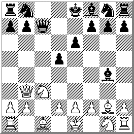 |
#2 WinBoard - Green 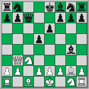 |
Which Chessboard Looks Better?
Time
to vote again! New choices!!
Click here to vote for your
favorite type of image.
Please
feel free to add a comment or two on
why you chose the image you did
| #1 ChessBase - Black & White  |
#2 WinBoard - Green  |
| #3 WinBoard - Black & White 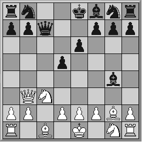 |
#4 WinBoard - Brown 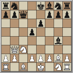 |
#3 All I can say is... wow! I wish other sites would use ANYof your four choices. I like them all. In fact, it was very hard deciding which one I liked the most. I was reading the comments on the previous page and I think I have to agree with the one about the ChessBase image and the "diagonal hatching" and "hypnotic effect." I can see where this might be a problem if I stared at a position with this image for too long. So, although I DO like the image, I can't vote for this one. At first I didn't like the brown one... I thought I could improve upon both your color brown for the dark and light squares... but my own attempts at improving it were unsuccessful. I found If I made the darker squares any darker, they blended in too much with the Black pieces. And if I made the light squares any lighter, I thought they blended in too much with the White pieces! I thus concluded that your brown WinBoard set wasn't so bad after all! I love the Green WinBoard image. I play with those green roll-up boards too and this diagram resembles that very nicely. For a long while I figured I was going to vote for this one. But ya know what... I'm think I'm going to vote for the black and white WinBoard image! What originally was my last choice has suddenly, for reasons which I can't explain, become my favorite! The light squares are not too light and the dark squares are not too dark. It's simple, to the point, and I find while looking at this image that I'm concentrating on the position! And isn't that what's important? I've since changed the colors in my own WinBoard program to look like these. Thanks! |
#3 I copied the green and the black & white to a Word document with a plain white background. The green improved, but the low contast black and white is great. |
#4 Although I'm not a big fan of brown, #4 has good contrast without being tasteless, like the green one, and the black and white boards are just boring. |
#2 I like the green and gray, although, the brown and tan is easy on the eyes. If I have to choose one... I'll take the green please. |
#1 I may be old fashioned, but the original black and white board keeps it simple for me. |
#2 The colors and square outlines are the most pleasing to the eye. |
#3 I am a Winboard user, and I use the black and white colours similar to which is displayed in selection #3, except for the White pieces, I use a pale yellow, and for the White squares, and even paler shade of yellow, (almost white). I find this very easy on the eyes. |